深入了解圆角属性border-radius
border-radius其实是一个缩写:
- border-top-left-radius
- border-top-right-radius
- border-bottom-left-radius
- border-bottom-right-radius
左上-右上-右下-左下
html
<div class="w-100px h-100px bg-red rounded-8px"></div>html
<div class="w-100px mt-10px h-100px bg-red rounded-[8px_16px_24px_32px]"></div>位数的表现
只说明2位、3位情况下的表现
html
<div class="w-100px h-100px bg-red rounded-[8px_16px_32px]"></div>html
<div class="w-100px h-100px bg-red rounded-[8px_16px]"></div>INFO
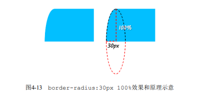
需要注意百分比与绝对值差异
- 宽度为100px,高度为100px
- 宽度为100px,高度为150px
当宽度不一致时,设置百分比与绝对值会出现差异
text
w-100px h-150px

rounded-[100%] => border-radius: 50px / 75px;

rounded-100px => border-radius: 50px;
水平半径和垂直半径
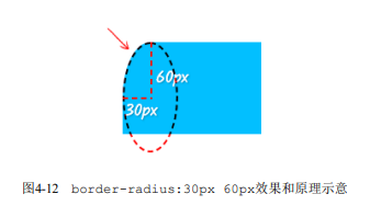
其实border-top-left-radius也是缩写,可以传入两个值
- 第一个值为水平方向半径
- 第二个值为垂直方向半径
如果是border-radius属性,则水平半径和垂直半径不是通过空格进行区分,而是通过斜杠区分
实现原理
border-radius属性渲染border边框的细节
设置了border-radius和border的元素,最终的视觉效果分为内半径、外半径
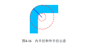
- 外半径:根据设置的border-radius设置
- 内半径:border-radius - border-width,如果值为负值,则内半径为0;反之则设置为结果值
- 外半径:40px
- 内半径:40 - 38 = 2px