CSS渐变
深入了解linear-gradient()线性渐变
text
linear-gradient(white, skyblue);默认时从上到下:to bottom
html
<div
  class="w-full h-100px "
  style="background: linear-gradient(white,skyblue)"
></div>
方向
渐变的方向共有两种表示方法:
- 一种是使用关键字to加方位值:例如to-bottom、to-left
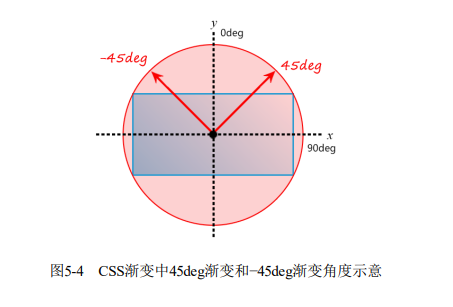
- 另一种是直接使用角度值:例如30deg,坐标原点为元素中心点,顺时针为正
渐变的起点和终点
html
<div
  class="w-300px h-150px"
  style="background: linear-gradient(45deg, white 100px, skyblue 100px 200px, white 200px)"
></div>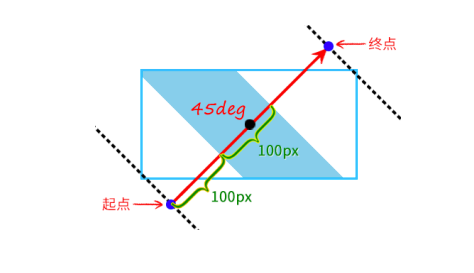
关于渐变断点
- 渐变断点至少有2个颜色值
text
/* 不合法 */
linear-gradient(white);- 语法中,
颜色在前,位置在后
text
/* 不合法 */
linear-gradient(white, 50% skyblue);- 没有指定位置时,自动等分
html
<div
  class="w-full h-100px "
  style="background: linear-gradient(red, orange, yellow, green);"
></div>

等价于

<div
  class="w-full h-100px "
  style="background: linear-gradient(red 0%, orange 33.3%, yellow 66.6%, green 100%);"
></div>- 位置可以为负数,也可以大于100%
text
linear-gradient(white -50%, skyblue, white 110%);html
<div
  class="w-full h-100px "
  style="background: linear-gradient(white -50%, skyblue, white 110%);"
></div>- 除直接设置渐变断点之外,我们还可以设置颜色的转换点位置
html
<div
  class="w-full h-100px "
  style="background: linear-gradient(white, 50%, skyblue);"
></div>
在50%位置处渐变
渐变与动画
CSS渐变本质上是一个<image>图像,因此无法使用transition属性实现过渡效果,也无法使用animation属性实现动画效果。
深入了解radial-gradient()径向渐变
径向渐变指的是从一个中心点向四周扩散的渐变效果,光的扩散、波的扩散等都有径向渐变的特性。
最简单的径向渐变语法
html
<div
  class="w-full h-100px "
  style="background: radial-gradient(white, skyblue);"
></div>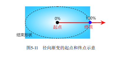
默认渐变半径为长轴、短轴的一半
设置渐变半径的大小
html
<div
  class="w-full h-100px "
  style="background: radial-gradient(100px 50%, white, skyblue);"
></div>
INFO
可以同时设置百分比和绝对值,但是在合并x轴、y轴使用时不能单独设置百分比
text
/* 不合法 */
radial-gradient(50%, white, deepskyblue);

/* 合法 */
radial-gradient(50%, 50%, white, deepskyblue);
设置渐变中心点的位置
可以使用at <position>语法设置渐变中心点,默认为at center
html
<div
  class="w-full h-100px "
  style="background: radial-gradient(100px 50% at left top, white, skyblue);"
></div>
也可以设置偏移量
html
<div
class="w-full h-100px "
style="background: radial-gradient(100px 50% at left 100px top 10px, white, skyblue);"
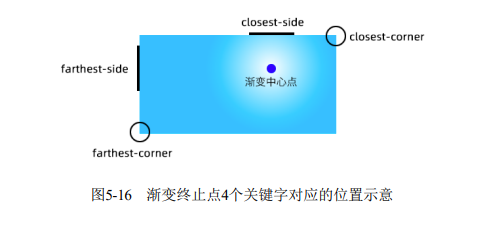
></div>设置渐变终止点的位置
| 关键字 | 描述 |
|---|---|
| closest-side | 渐变中心距离容器最近的边作为终止位置 |
| closest-corner | 渐变中心距离容器最近的角作为终止位置 |
| farthest-side | 渐变中心距离容器最远的边作为终止位置 |
| farthest-corner | 默认值。渐变中心距离容器最远的角作为终止位置 |
这些都是相对于渐变中心点而言的
html
<div
  class="w-full h-100px "
  style="background: radial-gradient(farthest-corner circle at right 100px bottom 100px, white, deepskyblue);"
></div>
应用
- 炫彩按钮
html
<button
  class="color-white"
  style="background-color: #2a80eb;
background-image: radial-gradient(farthest-side at bottom
left, rgba(255, 0,
255, .5), transparent),
radial-gradient(farthest-corner at bottom right, rgba(255,
255, 50, .5),
transparent);"
>
  hello world
</button>
测试
radial-gradient(white, deepskyblue);
radial-gradient(ellipse, white, deepskyblue);
radial-gradient(farthest-corner, white, deepskyblue);
radial-gradient(ellipse farthest-corner, white, deepskyblue);
radial-gradient(at center, white, deepskyblue);
radial-gradient(ellipse at center, white, deepskyblue);
radial-gradient(farthest-corner at center, white, deepskyblue);
radial-gradient(ellipse farthest-corner at center, white, deepskyblue);