字体渐变色
css中的字体渐变色主要可以通过两种方式实现background-clip和mask
background-clip
功能与它的名字大致相同:裁剪背景图,提供了4种内置的值:
border-box 背景延伸至边框外沿(但是在边框下层)。
padding-box 背景延伸至内边距(padding)外沿。不会绘制到边框处。
content-box 背景被裁剪至内容区(content box)外沿。
text 背景被裁剪成文字的前景色。(可能会有兼容问题)
WARNING
虽然在常见的css属性种并没有顺序而言,但是在使用background-clip时,需要保证在background之后,否则无效
html
<!doctype html>
<html lang="en">
<head>
<meta charset="UTF-8" />
<meta
name="viewport"
content="width=device-width, user-scalable=no, initial-scale=1.0, maximum-scale=1.0, minimum-scale=1.0"
/>
<meta http-equiv="X-UA-Compatible" content="ie=edge" />
<title>Document</title>
<style>
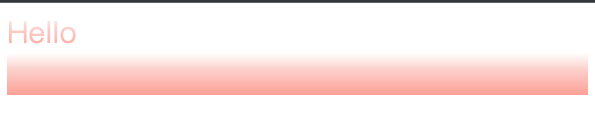
.hello {
font-size: 30px;
/* background在前 */
background: linear-gradient(180deg, #fefffe 0%, #fccfca 40.9423828125%, #fda096 99.31640625%);
/* background-clip在后才有效果 */
-webkit-background-clip: text;
color: transparent;
}
.world {
font-size: 30px;
-webkit-background-clip: text;
color: transparent;
background: linear-gradient(180deg, #fefffe 0%, #fccfca 40.9423828125%, #fda096 99.31640625%);
}
</style>
</head>
<body>
<div class="hello">Hello</div>
<div class="world">world!</div>
</body>
</html>mask
允许使用者通过遮罩或者裁切特定区域的图片的方式来隐藏一个元素的部分或者全部可见区域。在使用时:
- 绑定要渐变色展示的文案到text属性上,并设置好字体颜色
html
<style>
  .hello {
    font-size: 30px;
    color: #fefffe;
    position: relative;
  }
</style>
<div class="hello" text="Hello">Hello</div>- 声明对应的before伪类选择器,添加mask以及渐变色
html
<style>
  .hello:before {
    content: attr(text);
    position: absolute;
    color: #fda096;
    -webkit-mask: linear-gradient(180deg, #fefffe 0%, #fccfca 40.9423828125%, transparent 99.31640625%);
  }
</style>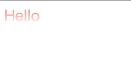
html
<head>
    <meta charset="UTF-8">
    <meta name="viewport"
          content="width=device-width, user-scalable=no, initial-scale=1.0, maximum-scale=1.0, minimum-scale=1.0">
    <meta http-equiv="X-UA-Compatible" content="ie=edge">
    <title>Document</title>
    <style>
        .hello {
            font-size: 30px;
            color: #FEFFFE;
            position: relative;
        }

        /*
        使用mask做渐变色字体需要注意:
        1.基础字体颜色color 对应 UI图上渐变色0%处的颜色 (初始颜色 )
        2.before伪选择器的color 对应 UI图上渐变色99%处的颜色(最终颜色)
        3.并且渐变色最终颜色、初始颜色其中一个必须是transparent
         */
        .hello:before {
            content: attr(text);
            position: absolute;
            color: #FDA096;
            -webkit-mask: linear-gradient(180deg, #FEFFFE 0%, #FCCFCA 40.9423828125%, transparent 99.31640625%);
        }

    </style>
</head>
<body>
<div class="hello" text="Hello">Hello</div>
</body>
</html>